Iterating on a Hellbenders Character Sheet
This is gonna be a dry one, but I wanted to highlight some feedback and help I've gotten from Zak, Binary Star Games, and Ken in my process of redesigning the Hellbenders character sheet.
A couple of weeks ago I got to run the first test session of Hellbenders. This is my first game design project, so I knew intellectually that I would learn more from two hours at the table than I did from the last 80 hours of staring at my rules document. My first cut at a character sheet was incredibly rough and was more of an exercise in geometry; can I physically fit all of the information I think I want on this sheet? My biggest constraint was that I thought it would be interesting to have a dedicated spot on the sheet for stacking poker chips, or Reserves. It was cute! But it took up about a third of the US letter format I was using.
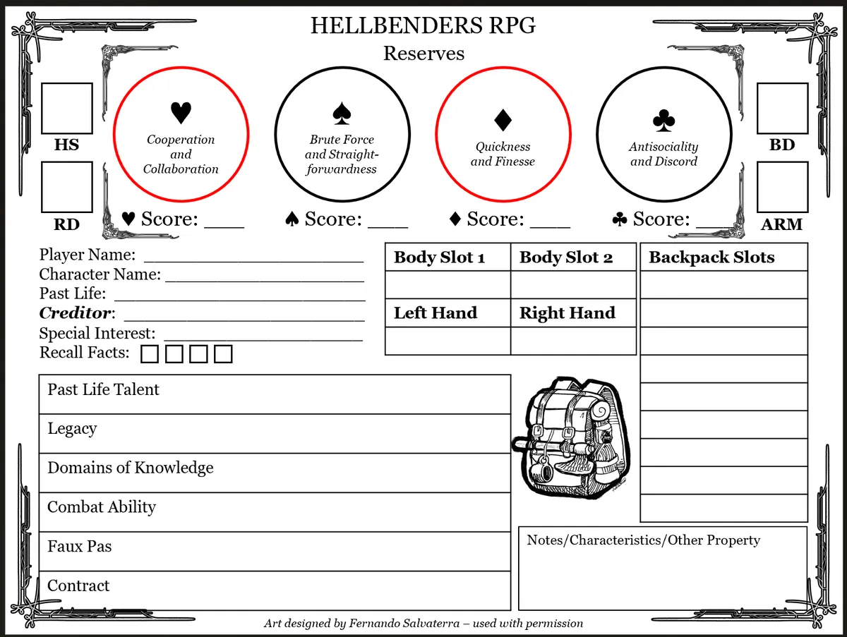
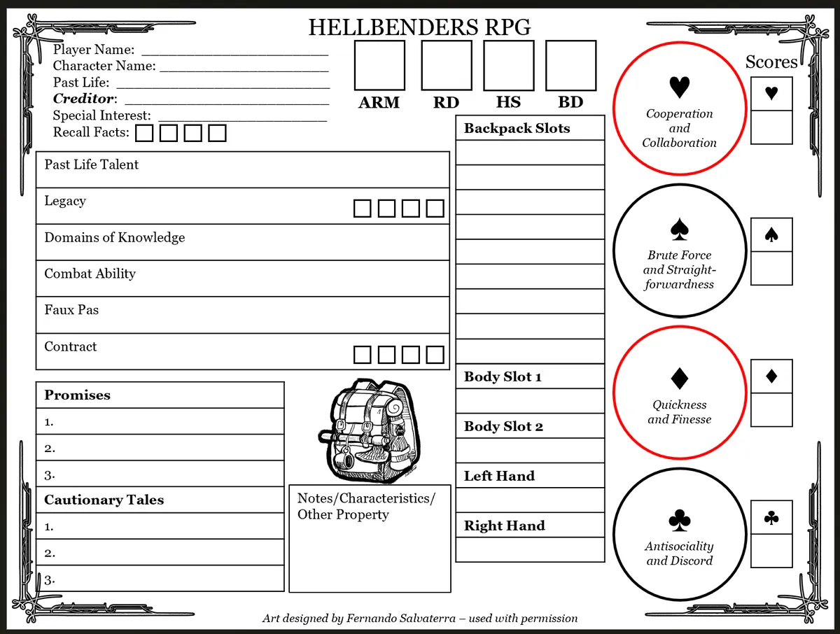
As I mentioned in the playtest post, the first issue was that I was missing literal rules data; I forgot to put in any area to track our Recall Facts resource. Additionally, I got feedback from my players that it would be useful to have some sort of shorthand for what our Suit Scores meant. Any time you're deviating from sort of traditional stats, that is a reasonable ask. Then, since that first playtest we've compiled some progression mechanics that we basically must track on our character sheet. Hence, earlier this week, we try to cram everything onto that same sheet of paper:
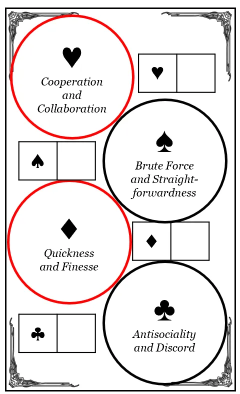
At this point I solicited some feedback from friends who are more experienced in game design and UX than I am. I posted the sheet, went to bed, and woke up to some really interesting thoughts. From a strict UX perspective, I got the question "won't it be annoying to write on a sheet of paper with tokens on it?" Hm. Probably. Ken had some novel ideas on how to more efficiently stack the poker chip discs, but Zak asked why not just throw them onto an index card? Luckily, I had my poker chips and index cards in my office. I tried a couple of physical mockups and designed a little extra printout of The Chip Zone. This is a 3x5" tile and I can fit four onto a US letter page. Alternately, an index card is just fine.
Then, holy smokes! Now we have a third of our character sheet back! What a dream! So I go into reformatting and try stretching my legs a little bit. I shared this iteration, saying "I'm happy with this."
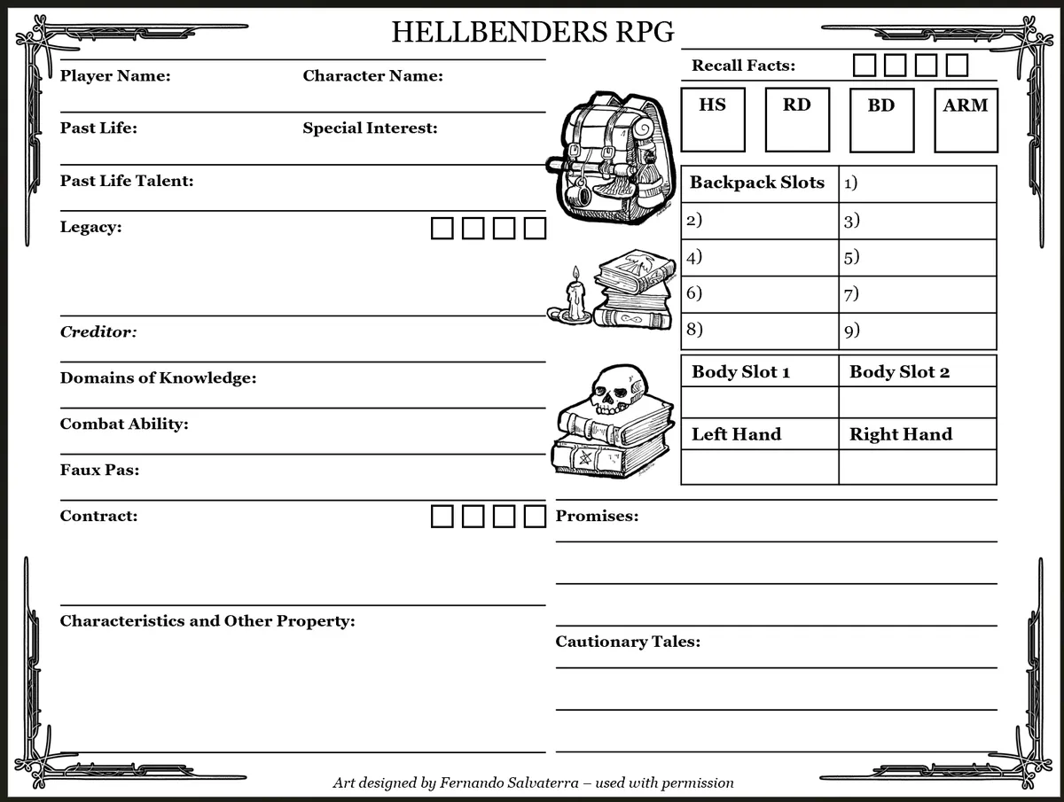
Binary very politely asks if I'm in a headspace to receive some feedback, and I very bravely say yes. He mentions that it looks like I'm not really using a grid to drive my alignment or white space. I say, "what?" and he links me to an incredible layout primer from Clayton. I recommend any amateur without a background in design check that out and learn from it.
I tried to do a four-column layout with 0.3" gutters and then alternating rows and alleys of 0.8" and 0.4" respectively. Thing is, I really didn't know what I was doing, so Ken threw on a 12-column overlay and told me to ditch rows and alleys: just go with a fixed line height corresponding to whatever gutter I pick. What he noticed is that I still had elements that weren't aligned to any part of the grid and it was really frustrating my visual flow.
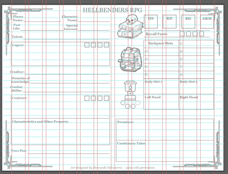
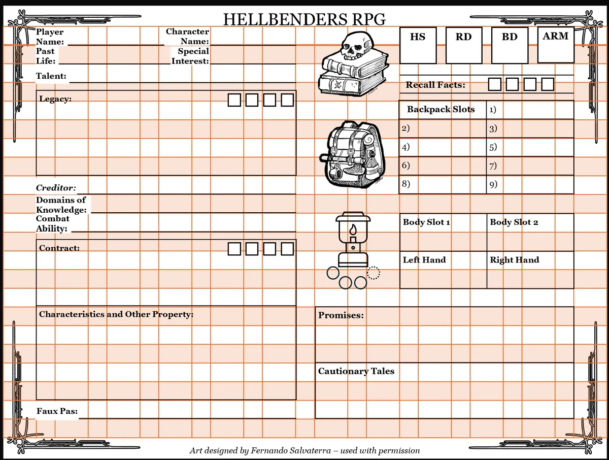
He recommended an 8mm (0.31") gutter and sent me back to work. I'm really happy with the current status! Here is the current iteration with and without my grid overlay.
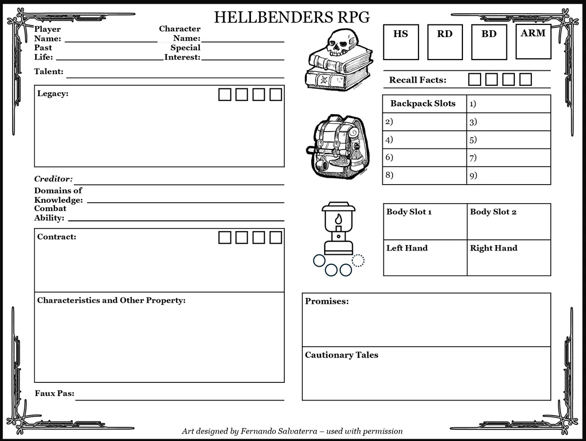
Looking forward, I think I want to monitor "entropy" on the character sheet and make sure that I have it concentrated to minimal hot spots. The motivation for tracking Reserves (which also act as Stamina) with poker chips is that resource tracking is typically the biggest entropy driver, it changes constantly and if you're erasing and rewriting small integers on your sheet you'll just wear through the pulp. I think we have isolated the worst-case entropy to our inventory section and everything else is likely to change maybe once per session.
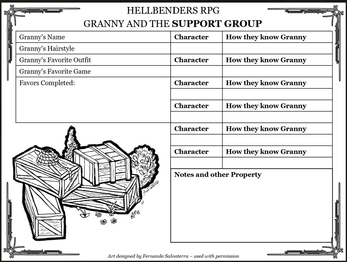
The last element that we haven't talked about as much is the character sheet for Granny and her Support Group. This is primarily GM facing and is just a way to track the sort of hub-and-spoke structure of the adventuring party. I have a snapshot here but it's nothing to write home about :)
I hope that anyone else who is frustrated by graphic design enjoys reading this and can take away some camaraderie! Cheers. And if you like the art assets used here, please check out Fernando Salvaterra's Patreon!.